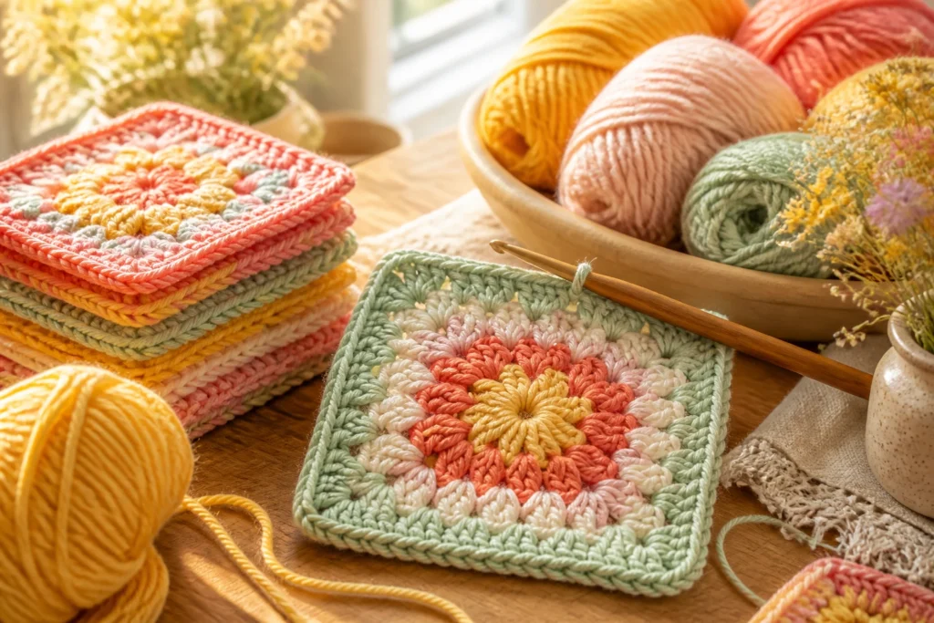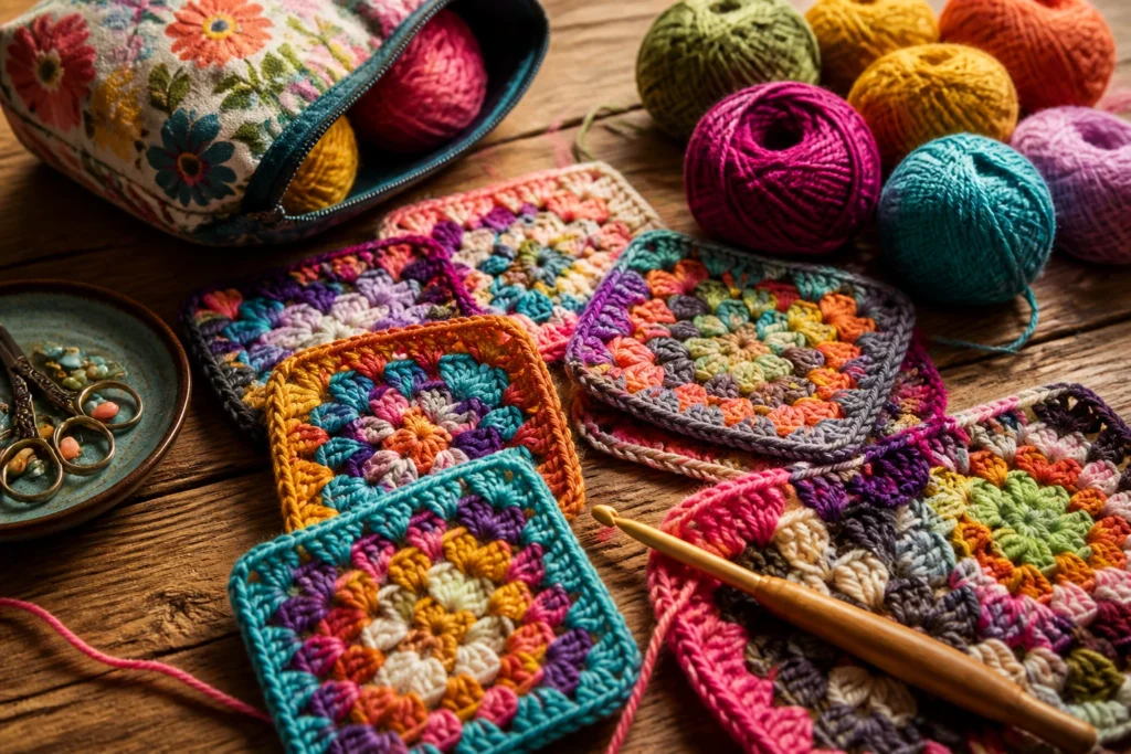
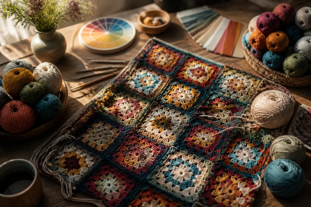
Unless you’ve been living under a crochet hook, you know granny squares aren’t shy about color. They scream nostalgia, coziness, and a little DIY magic. Choosing colors for traditional Granny Squares isn’t just picking pretty hues; it’s about balance, contrast, and that satisfying “yarn porn” moment when every square finally sits right beside its neighbors. Let’s dive in like we’re shopping for a blanket you’ll actually finish.
What makes traditional Granny Squares tick color-wise
Granny squares have a built-in rhythm. You’ve got clusters, you’ve got spaces, and yes, you’ve got the classic four-row pop of color. The magic isn’t in any single shade—it’s in how shades play with one another across the whole blanket. Think of it as a color choir: one bold note, two supporting echoes, and a chorus of neutrals to keep it from shouting.
– Contrast is your best friend. You want light against dark, warm against cool.
– Repetition is your friend, too. Repeating colors creates harmony and makes the blanket feel intentional.
– Neutrals act like glue. They soften bold hues and keep the eye from jumping around too much.
Ask yourself before you start: do I want a throwback vintage vibe or a modern, bright pop? Both work, but they require different balance tricks. FYI, the worst offender is a pile of random colors that never sit together. Don’t be that person.
Choosing a color palette: the easy, practical way

If color theory sounds scary, breathe. You don’t need a degree in design to nail Granny Square palettes. Here’s a practical approach that works in real life.
– Start with a neutral backbone. Choose 1–2 neutrals (cream, ivory, taupe, or heather gray). They’ll keep the overall thing from turning into a color explosion.
– Pick a five-color core. Choose 2 bolds, 2 mid-tones, and one accent that you’ll sprinkle sparingly.
– Consider temperature. Do you want warm cozy (reds, oranges, yellows) or cool serene (blues, greens, purples)? You can mix, but be deliberate about the vibe.
– Use a color ramp, not a color burst. Think light-to-dark progression within your chosen hues, so the squares feel cohesive as they stack up.
How to test without buying a million skeins:
– Create a tiny swatch board. Cut a few paper circles in your chosen hues and place them beside a neutral. Move around until you feel the balance.
– Use digital tools sparingly. A quick photo with grayscale can reveal if your palette reads well without chroma chaos. Yes, this works for real kids, not just designers.
Top color combos that make Granny Squares sing
Some combos are classics for a reason. They’re reliable, charming, and surprisingly forgiving. Mix and match, but keep the spirit:
- Cream + Sage + Coral + Navy + Chocolate: vintage cottage Chic with a wink. Neutral backbone, nature-inspired accents.
- Ivory + Mustard + Teal + Plum + Charcoal: warm, earthy, and a touch regal. Perfect for a heritage look.
- Blush + Peach + Sage + Steel Blue + Cream: soft, airy, and a touch modern.
- Oatmeal + Rust + Olive + Indigo + Black: bold with a rustic edge. Imagine autumn in a blanket.
- Snow + Berry + Fern + Cobalt + Cocoa: playful but grounded. Funky, but not chaotic.
– Pro move: for each palette, pick one “hero” color to be used most frequently, one “supporting” color, and one “punchy” color to pop at strategic spots. The neutrals do the rest.
How to map colors across the squares

Consistency is your friend. Without it, you’ll end up with a quilt that looks like a rainbow exploded and then sighed in defeat.
– Use a four-round cycle per square. Classic granny squares typically have a center color, then three rounds of a contrasting color, then a final round that ties it all together. You can switch the cycle up, but know the rhythm before you begin.
– Decide color roles before you crochet. Assign a color for the center, a color for the first round, a color for the second round, and a color for the outer edge. This stops you from grabbing whatever color happened to be near the hook.
– Hold a “palette board.” A small sheet or sticky notes with color assignments helps you visualize the final spread before you stitch a single chain.
– Plan placement. If you’re aiming for a gradient effect, order your squares by color family as you sew them together. If you want a blocky retro look, group similar squares into chunks.
Creating balance: how many colors per square vs. per blanket
This is where many people trip. Too many colors inside one square can look busy; too few across the blanket can feel flat. The sweet spot tends to be three to four colors per square, with the blanket using 5–7 colors total (including neutrals).
– Inside each square: use 2–3 colors plus a neutral. The center color can be a repeat or a new hue, depending on drama level you want.
– Across the blanket: spread your palette so every color shows up enough times to feel intentional but not overpowering. If you love a particular shade, plan multiple squares that feature it as a main color.
– Edge effects: use a consistent outer color on the squares’ borders to unify the whole thing. A single neutral edge around every square often makes the assembly feel cohesive.
Subtle tricks that elevate granny square color-picking
Small touches make a big impact. Try these if you want your project to look thoughtfully assembled rather than random.
Subsection: playing with light and dark to create depth
– Place darker squares toward the center and lighter ones toward the edges for a gentle “lift.”
– Or do the opposite for a vintage sunburst effect. It’s your blanket, you decide where the drama lives.
Subsection: using a color-echo principle
– If you have a bold color in one square, echo that color in a neighboring square’s border or a surrounding stripe. It creates rhythm without shouting.
Subsection: considering yarn weight and texture
– If you mix yarn textures (e.g., a matte cotton with a slight sheen), test them together. They reflect light differently, which can affect perceived color.
Monochrome options: surprisingly delightful
Granny squares aren’t just about multi-color bursts. A near-monochrome quilt with just a few shades can feel timeless and elegant.
– Choose a family of similar hues (e.g., blues: baby, powder, navy; greens: mint, olive, emerald).
– Use a single neutral (cream or ivory) to pull the palette together.
– Let texture do the talking. Subtle tonal differences between yarns, plus a satin or velvet edge, make the blanket feel luxe without a color overdose.
Is monochrome boring? Not if you lean into contrast via value differences and pattern density. You still get visual interest without a rainbow melty brain.
Practical tips for choosing and buying yarn
Getting the colors right starts with the right yarn, so a few practical notes.
– Choose a single brand for a consistent dye lot. If you mix brands, be aware shading may differ.
– Pick a worsted weight or DK you love. Granny squares look best when the yarn has good stitch definition and comfy texture.
– Buy extra for dye lots. Grannies love a few extra skeins to accommodate color shifts or mistakes.
– Think about wear and wash. If you’re making a blanket for a couch potato with pets, pick colorfast options that hide a little everyday drama.
And yes, you’ll probably discover a new favorite color you didn’t plan on using. FYI, it’s normal and perfectly acceptable.
Implementation: from plan to pile of squares
You’ve picked your palette. Now you stitch.
– Start with a few test squares. Crochet 2–3 squares in your planned color cycle to see how they read together.
– Keep a color map. A simple list with square numbers and color assignments helps you track progress and prevents color chaos.
– Assemble in stages. Sew squares into strips first, then sew strips into the full blanket. This helps you visualize the evolving pattern and adjust early if needed.
– Block lightly after joining. A gentle block can even out seams and give you that crisp Granny Square look.
Real-world scenarios: palettes you’ll actually use
Here are everyday vibes you can aim for, with quick prompts to get you started.
– Cozy cabin retreat: neutrals with deep forest and cranberry accents. Add a warm terracotta rim for warmth.
– Coastal cottage: creams and whites with sea-glass greens and a splash of navy. A light blue edge ties it all together.
– Modern Hygge: soft pastels with a pop of charcoal. Keep the number of colors restrained for a calm finish.
– Retro kitchen throw: butter yellow, avocado green, tomato red, and a dash of burnt orange. Let the neutrals mute the energy just a touch.
FAQ section
What if I hate a color in my palette after I start?
If a color isn’t feeling right, swap it out in future squares and adjust the rest of the squares you’ve yet to crochet. You don’t have to redo finished squares—just replace future ones. The beauty of Granny Squares is that you can reassemble with a fresh energy.
How many squares do I need for a standard throw?
It depends on your desired blanket size and the size of your granny squares. A common mid-size throw uses around 60–80 squares when you’re making 4-inch squares. If your squares are 5 inches, you’ll need fewer; if they’re 6 inches, you’ll need more. Measure your target finished dimensions and plan accordingly.
Should I use the same color for every outer edge?
Consistency in the outer edge color helps unify your blanket, especially when you mix many colors. If you want a bolder look, you can alternate edges or pick a contrasting edge color for an eclectic finish. Either way, know your plan before you sew.
Can I crochet Granny Squares with variegated yarns?
You can, but there’s a caveat: variegated yarn creates unpredictable color shifts. If you love the effect, run with it. If you want a clean, traditional look, prefer solid or semi-solid yarns to maintain color balance.
What about color fading with washing?
Some dyes fade faster than others. To minimize surprises, wash a test-square in the same way you’ll wash the blanket and compare color after a gentle cycle. If you expect lots of use, consider colorfast or higher-quality dyelots to reduce fade.
How do I decide between warm vs cool color families?
Ask what vibe you want. Warm palettes feel cozy and nostalgic; cool palettes feel calm and contemporary. Mix carefully if you want both—use one color family as a unifying thread across the blanket and reserve the others for accents.
Conclusion
Wrapping it up: color is the story of your granny square blanket
Choosing colors for traditional Granny Squares isn’t about chasing the latest trend. It’s about creating a cohesive, comforting tapestry that reflects your taste and your space. Start with a solid neutral, pick a thoughtful five-color core, and let neutrals glue the whole thing together. Test early, map your colors, and don’t be afraid to swap out shades if your heart says no.
If you want a blanket that feels vintage with a wink, lean into warm, earthy tones and a soft cream background. If you crave modern, bright happiness, go bold with clean contrasts and a restrained neutrals plan. And if you’re somewhere in between, a gentle pastel palette with a single dark anchor can deliver that “just right” balance.
Remember: the joy of Granny Squares isn’t just in the finished blanket. It’s in the process—the selection, the planning, the tiny triumphs when you realize your rows are perfectly aligned. So grab your yarn, pick your color story, and crochet like you’re chatting with a friend who totally gets your obsession. IMO, this is the kind of cozy project that makes the world feel a little softer, one square at a time.