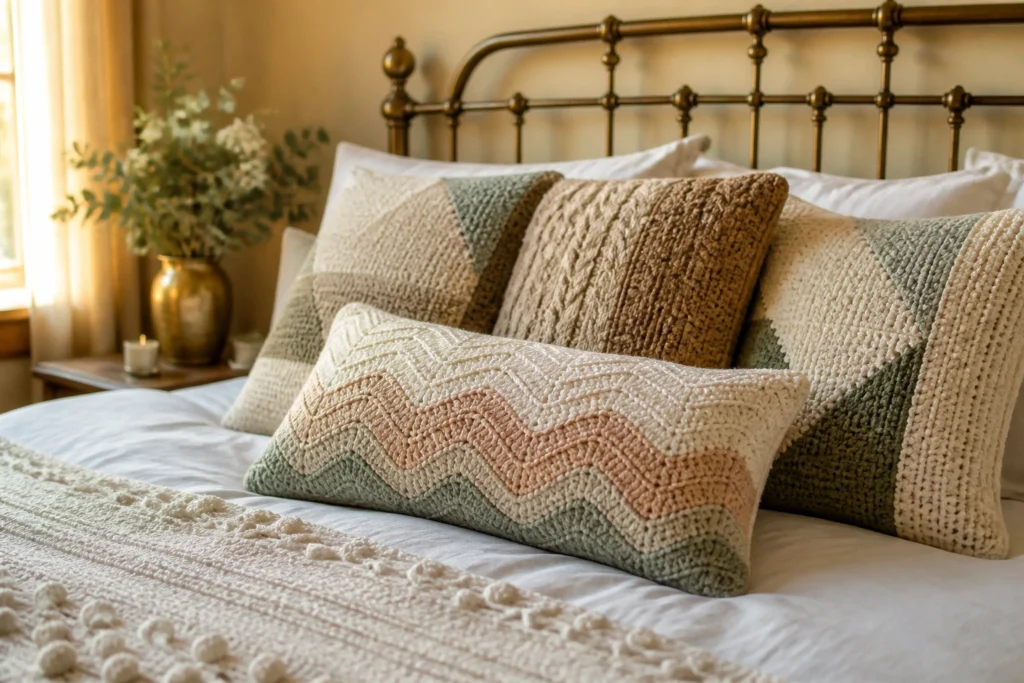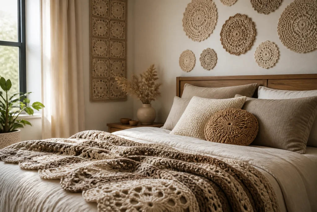
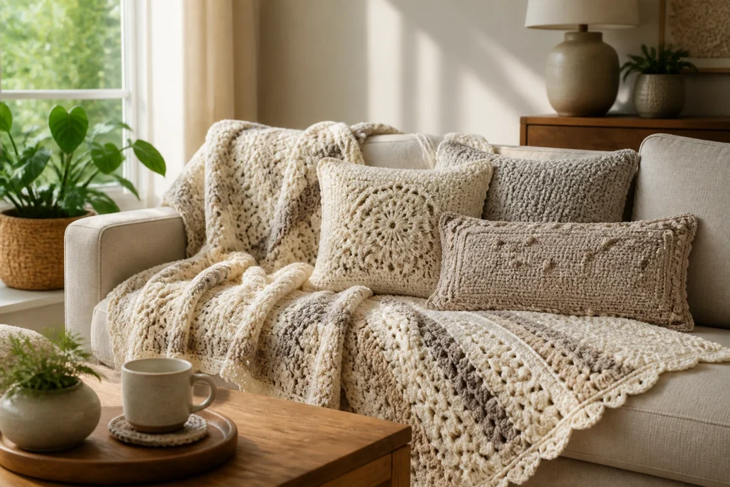
We all know crochet home decor can be a mood booster. But picking the right colors is the magic trick that turns a blanket into a centerpiece and a pillow into personality. Let’s dive into the color science of crochet and how to make your spaces sing without turning into a color wheel migraine.
Color Choices that Sing: How to Pick without Drowning in Options
Choosing colors for crochet home decor isn’t about chasing every trend. It’s about harmony, contrast, and a little bit of bold personality. Start with the vibe you want: calm, bold, whimsical, cozy? Then translate that into a color story you can actually live with.
– Start with a base. Pick 2-3 core colors you love and that fit your room.
– Add accents. A pop of a contrasting hue can wake things up.
– Consider lighting. Natural light vs. bulbs can flip a color’s mood.
Think of your project as a tiny room in your house. Your yarn palette should feel like it could share a cup of coffee with your furniture palette, not crash the party.
Neutrals First: Cozy, Flexible, Timeless
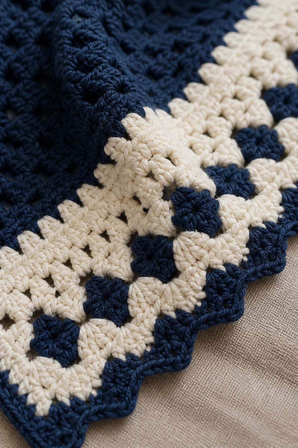
Neutrals aren’t boring; they’re the unsung heroes of crochet home decor. They adapt, they layer, they hide no sins when you spill coffee on a throw. If you love a timeless look, neutrals are your best friend.
Key neutrals to consider:
– Creams and ivories for warmth without shouting
– Soft grays for a modern edge
– Taupe and dusty beige for earthy vibes
A quick trick: tonal textures
When you crochet in neutrals, texture becomes the star. Different stitches—shells, baskets, bobbles—catch light and shadow in interesting ways. FYI, texture can make a plain color look fancy without extra colors.
Warm Palettes: Comforting and Inviting
If you want spaces that feel snug enough to hug, warm colors are your go-to. They wrap you up and say, “Stay awhile.” Think terracotta, amber, coral, and warm sage.
– Terracotta gives depth and a touch of rustic charm.
– Amber and mustard can punch up dull corners.
– Warm sage or olive adds a garden-like calm.
How to balance warmth with energy
Warm tones can overwhelm a room if you overdo them. Pair a warm crochet piece with cool accents—think a slate pillow or a charcoal border—to keep the space from feeling sunflower-bright all day.
Cool Color Stories: Calm, Fresh, and Modern

Cool tones bring a breath of fresh air. They read as serene and clean, perfect for bedrooms or bathrooms where you want to unwind.
– Blues: from powder to denim create a coastal or nautical vibe.
– Greens: eucalyptus to pine evoke nature; pair with crisp whites for a spa-like feel.
– Purples: lavender or lilac add a soft, whimsical punch without shouting.
Layering cool tones with warmth
If you’re worried cool colors feel stark, soften them with a warm accent—think a cream border, a sandy tassel, or wooden furniture. The goal is balance, not a color cold war.
Pop Colors: Bold Statements without Overwhelm
Ready to break out the confetti? A few well-placed pops can turn crochet into a focal point. Use bold colors strategically so they sing without overpowering.
– Pick one statement color and repeat it in small doses for cohesion.
– Use accents in cushions, edge trim, or a single stripe in a blanket.
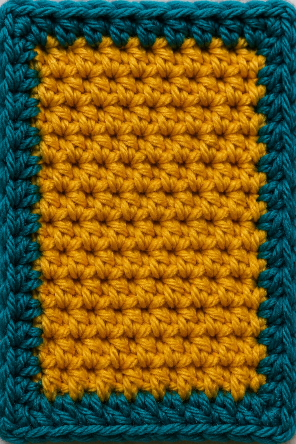
– Consider opposite hues on the color wheel for dramatic contrast—think teal with coral, or plum with lime.
Patterns within color: how to keep it cohesive
If you’re layering multiple bold colors, keep a shared thread—like a recurring yarn weight or a similar brightness level. That way your eye doesn’t bounce around in a caffeine-fueled frenzy.
Seasonal Transitions: How to Use Color Through the Year
Your home decor should evolve with the calendar, even if your yarn stash doesn’t. Seasonal color shifts can be mild and affordable.
– Spring: swap in fresh greens, blush pinks, and airy whites.
– Summer: go breezier with ocean blues and sunshine yellows.
– Autumn: lean into deep oranges, burnt sienna, and forest greens.
– Winter: opt for icy blues, charcoal, and rich creams.
DIY swap outs you’ll actually do
Choose items with removable borders, tassels, or reversible motifs. A blanket with a reversible colorway lets you switch the vibe in minutes.
Texture Meets Color: How Fiber and Hue Play Nice
Color isn’t the whole story. The fiber you choose influences how a color reads. A soft acrylic might look brighter than merino in the same light, and cotton has a bit more matte finish than silky blends.
– Cotton: vibrant but matte; great for throws and placemats.
– Acrylic: affordable and bright; easy care but can look plastic under harsh light.
– Wool: rich depth and warmth; comes with a cozy sheen that softens bold colors.
Practical tips for color testing
– Do a quick swatch: crochet a small square in your top choices and lay it in the room at different times of day.
– Tape swatches to the wall for a few days to see how they interact with existing decor and lighting.
– Take photos under your room lighting; colors look different on screen and in reality.
Mixing Patterns and Colors: When to Go Bold, When to Go Subtle
Patterns can amplify color or tame it. If your room already has patterns, choose simpler crochet motifs in calmer tones. If your space is minimal, you can go wild with texture and color without fighting the furniture.
– Match scale: small patterns + small prints, big patterns + bold hues.
– Keep the color number manageable: 3-4 colors per piece is a good rule of thumb.
– Use the same color family across different pieces to tie the room together.
Subtle accents that pack a punch
A single edge stripe in a contrasting color on a blanket or pillow can create a contemporary look without shouting. It’s like wearing a neon bracelet with a black dress—just enough zing.
FAQ: Quick Color Confidence for Crochet Home Decor
How do I choose colors that work with my existing furniture?
Choosing colors that harmonize with your furniture starts with observing undertones. Look at the wood, fabrics, and metals in the room. If your furniture reads warm, lean into warm neutrals or earthy accents. If it leans cool, opt for blues, greens, and cool grays. Test a few swatches against your furniture lighting to be sure you’re not going to clash in the middle of the night when you stumble to the sofa.
What if I’m color-shy—how can I start?
Start with neutrals and a single accent color. Crochet a small item, like a pillow or coaster, in that accent. You’ll get used to the hue in a low-stakes way. FYI, you can always re-crochet the accent if you change your mind.
Which color combinations feel timeless in crochet decor?
Think high-contrast neutrals with a single bold pop, or monochromatic palettes with varying shades of one color. For example, ivory with charcoal and a pop of teal reads classic, not chaotic. The key is spacing color blocks and using similar brightness levels.
How do I care for color longevity in crochet pieces?
Choose colorfast yarns and follow care labels. Pre-wash swatches to see if they bleed. If possible, hand wash or use a gentle cycle with cold water, and air dry to preserve shape and color. Avoid direct sun for long periods on bright colors to minimize fading.
Can color affect mood in a room?
Absolutely. Colors carry psychological weight. Blues and greens tend to calm, reds and yellows energize, and neutrals provide a grounding effect. If you want a room that feels cozy, blend a soft base with a warm accent. If you want a space that feels invigorating, pull in brighter hues with crisp whites.
Conclusion: Make It Your Colorful Crochet Corner
Color is your secret weapon, not a random afterthought. With a little intention, your crochet pieces can unify a room, highlight your personality, and even shift the vibe from “meh” to “wow.” Try building a simple palette first, test it in your space, and then crochet your heart out. IMO, starting small beats committing to an entire color overhaul.
Happy crocheting, friend. May your yarns stay soft, your color choices stay confident, and your living room feel like a hug you can wear. If you’re unsure, grab a swatch, snap a pic, and ask a buddy—sometimes a second set of eyes makes the color decision crystal clear. FYI, your future self will thank you for not winging it.