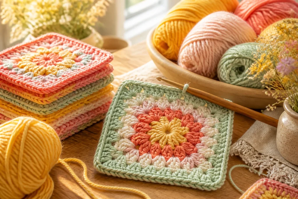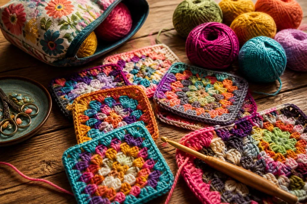

Ever tried choosing colors for Flower Granny Squares and felt like you walked into a paint store blindfolded? You’re not alone. Picking the right hues can transform a little motif into a statement piece. Let’s break it down, stitch by stitch, so you actually enjoy the process without turning your coffee into a color wheel.
Color comes alive when you know the mood you want
When you’re selecting colors, ask yourself: what feeling should this square give? Bright and playful? Soft and dreamy? Bold and modern? Your answer becomes a compass. If you want sunshine and energy, go for warm tones like corals, yellows, and bright pinks. For a calmer vibe, lean into cool blues, dusty purples, and sage greens. And if you’re chasing sophistication, pair deep jewel tones with a neutral anchor.
– Start with one hero color. Let it set the tone.
– Add two supporting colors that either lift or calm the hero.
– Sprinkle a neutral or two to balance the palette.
FYI: you don’t need a perfect color wheel to make something sing. Sometimes a single pop of contrast is enough to make those flower petals pop.
Choosing a palette: harmonious vs. high-contrast
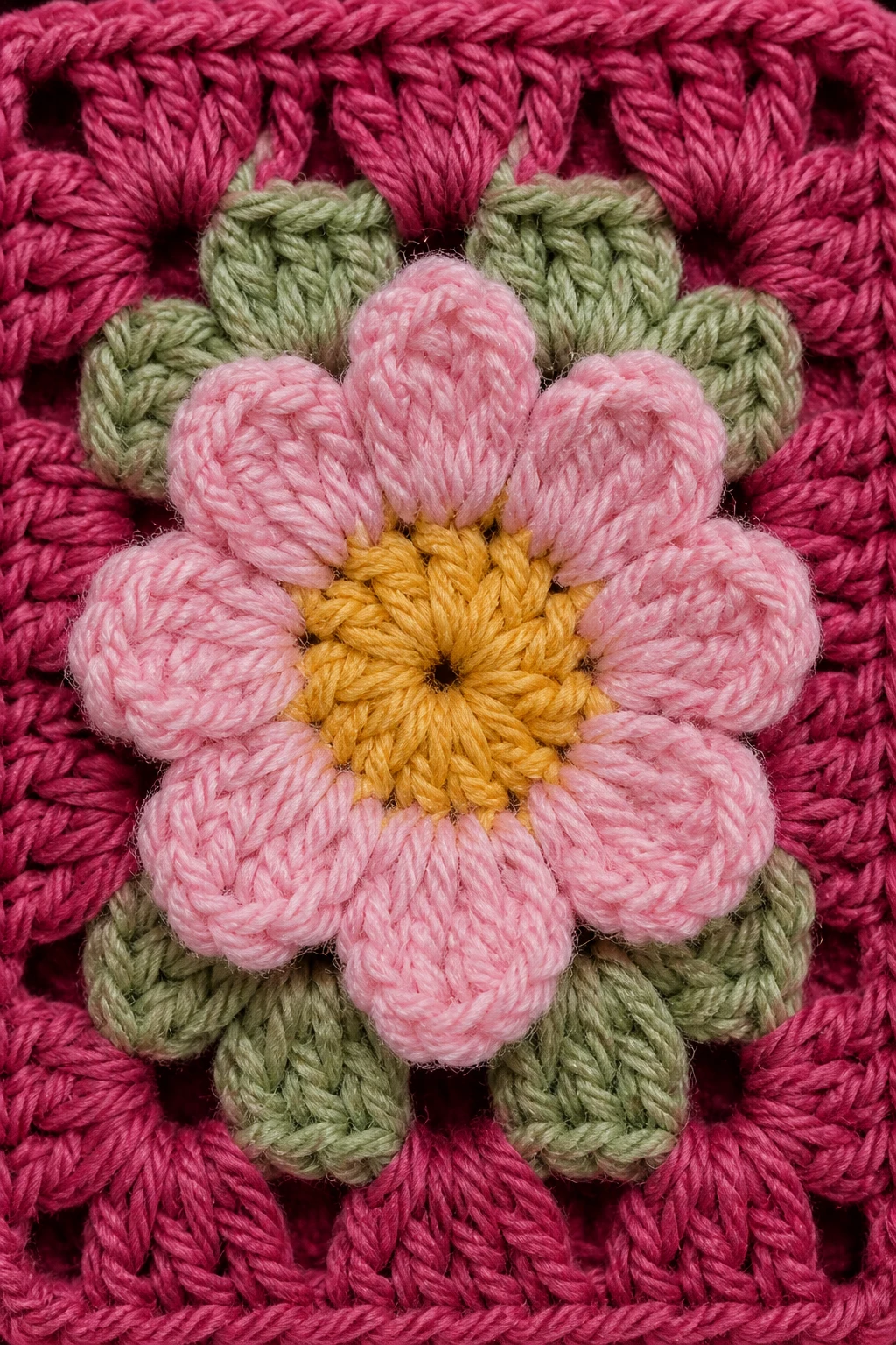
Two big camps exist: harmonious palettes and high-contrast palettes. Both have their charms, but they give you different vibes and outcomes.
– Harmonious palettes: Stick to colors that sit near each other on the color wheel. Think coral, peach, light pink, and cream. These feel cohesive, gentle, and cozy.
– High-contrast palettes: Pair a bold shade with a light neutral, or use opposite colors like teal and coral. These read lively and modern, perfect for a statement blanket or a showpiece.
Pro tip: limit yourself to 3–4 colors for a single granny square set. More colors can look chaotic unless you’re going for a wild, boho vibe. If you’re unsure, start with a harmonious trio and then test a pop color as an accent.
Color distribution in each square
A Flower Granny Square isn’t just about selecting colors; it’s about where you place them. Here’s how to distribute hues so the motif breathes and reads clearly.
– Center petals: Use your hero color here if you want the square to read as a bloom. It draws the eye to the middle.
– Outer petals: A lighter or slightly contrasting shade can make the flower feel delicate and airy.
– Background rounds: Reserve a neutral or muted color for the surrounding rounds to let the petals stand out.
– One accent color: If you want a little zing, tuck a tiny touch of a fourth color in a corner or a corner petal. Only a tiny sip of color, not a full shake!
Experiment with order and symmetry. Some people love a perfect mirrored pattern; others like a cheeky asymmetry that keeps the eye guessing. Either way, test a few arrangements on spare squares before you commit.
Texture, yarn weight, and how they influence color perception
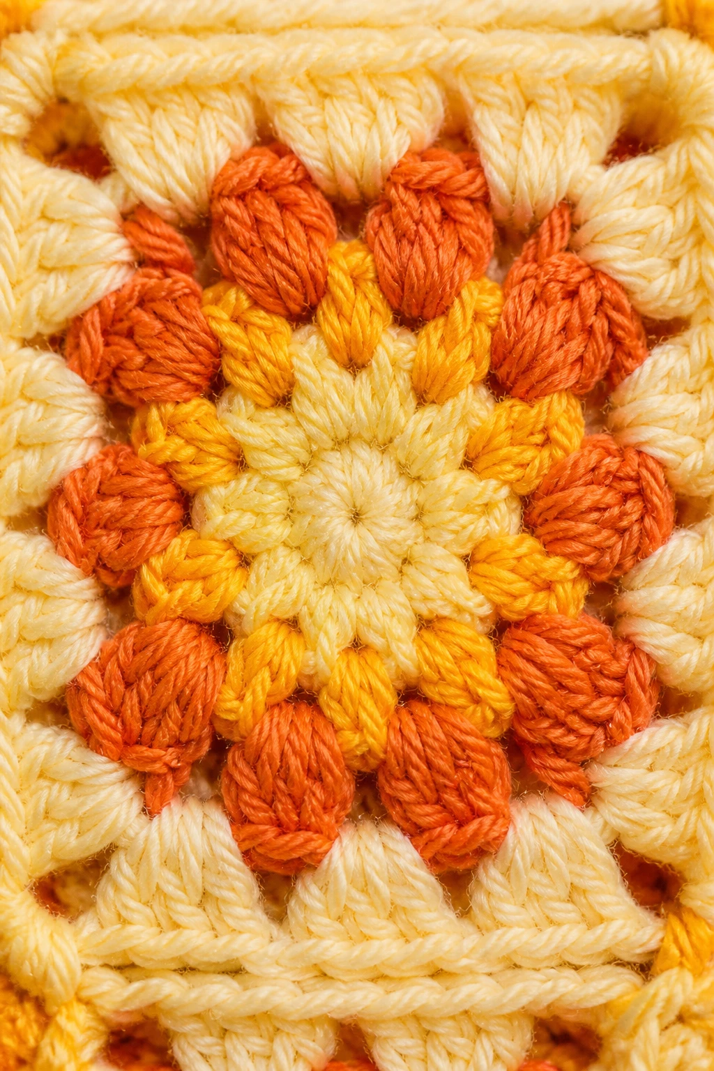
Colors don’t exist in a vacuum. The yarn you choose, its weight, and even the lighting in your space can change how a color feels.
– Yarn weight matters: Heavier yarn and chunkier blankets tend to mute colors a bit. Delicate lace will show color shifts more clearly.
– Material matters: Cotton often shows colors a touch brighter than acrylic, while wool can bring a cozy depth.
– Lighting changes everything: A sunny room makes colors pop; a dim corner can push them toward the muted side. If you’re gifting or photographing, consider the lighting you’ll use.
A quick practical approach: pick three test skeins in your planned palette and crochet tiny squares under different lights. If one color starts looking muddy or oversaturated, swap in a shade that reads better.
Building confidence: testing palettes before you commit
You don’t have to plunge in and color your whole project this moment. Do a quick palette test with a few mini squares. It’s cheaper than repainting a wall and way more satisfying.
– Create a mini sampler: 4–6 tiny squares using the planned colors.
– Photograph under natural light at different times of day. Note how colors shift.
– Compare to your vision board: does the sampler feel cohesive with your blankets, decor, or the other squares you’ve finished?
If something feels off, adjust. It’s only yarn, no one’s keeping score.
Seasonal and mood-driven palettes

Seasonality isn’t just for fashion. Let the time of year influence your color choices, if you want.
– Spring: Lots of fresh pastels, soft greens, baby blues, pale yellows. The vibe reads as “fresh and hopeful.”
– Summer: Brighter greens, turquoise, coral, sunny pinks, and white. Think beachy and vibrant.
– Fall: Mustard, burnt orange, deep reds, olive, and cream. Cozy and earthy.
– Winter: Jewel tones with a soft neutrals—emerald, sapphire, plum, and charcoal. Rich and crisp.
But don’t feel obligated to follow the season like a calendar. I’ve whipped up winter-worthy palettes with bright pinks and lime greens that somehow feel festive and unexpected. IMO, color stories are personal, not prison sentences.
Combining with existing blankets and decor
If you’re making Granny Squares to join into a larger blanket for a sofa or a bed, you’ll want color harmony with the rest of the room. Here are quick rules of thumb.
– Ground with neutrals: Use a neutral base in most squares and reserve color for petals and accents. This makes a big blanket feel cohesive.
– Echo, don’t copy: If a throw pillow or rug has a color you love, weave that hue into your squares as a smaller nod rather than duplicating it exactly.
– Balance warm vs. cool: If your room leans warm (wood tones, warm lighting), lean a bit warm in your yarns too. If it’s cool, cool-toned colors will match better.
And if you’re making a gift, ask a friend a couple of quick questions about their space. It’s amazing how a tiny color tweak can make something feel tailor-made.
Common mistakes (and how to avoid them)
We all slip into color traps now and then. Here are the not-so-obvious ones and how to dodge them.
– Mistake: Too many colors in one square. Fix: Choose a primary color, a secondary, and a neutral. If you must add a fourth, keep it in a small, deliberate place.
– Mistake: Colors fighting for attention. Fix: Create a visual hierarchy by giving the hero color the most space and letting the other hues support, not overwhelm.
– Mistake: Ignoring yarn sheen. Fix: Test how colors behave on the exact yarn weight you’ll use. A color that looks great on a skein may shift in a finished square.
– Mistake: Lighting lies. Fix: Check colors in several lights, especially if you’ll photograph the project. It’s never a bad idea to keep a daylight bulb handy for true color checks.
Practical steps to pick your colors in an afternoon
If you want a simple, fast method to pick your color story, try this mini-workflow.
– Step 1: Decide the mood. Do you want sunny and energetic, or calm and cozy?
– Step 2: Pick a hero color. Choose something you love looking at.
– Step 3: Add two supporting colors that either warm up or cool down the hero.
– Step 4: Grab a neutral. A cream, taupe, or light gray helps the colors breathe.
– Step 5: Optional accent. If you crave a pop, pick a tiny fourth color for a few standout petals.
– Step 6: Test on a small sampler. Adjust until you smile.
It’s okay if you change the plan midway. This is crochet, not a physics experiment. Flexibility is your friend.
FAQ
How many colors should I use in Flower Granny Squares?
You’ll get the best balance with 3–4 colors total per square set. One hero color, one or two supporting colors, and a neutral. A fourth accent color can work if used sparingly. Less is often more, especially for beginners.
What if I can’t decide between two similar shades?
Pick one and crochet a quick mini-swatch with both. Compare how they read under different lights. If one looks muddy or washed out, choose the other. Trust the one that sparks joy in you.
Can I mix cotton and acrylic yarns in the same blanket?
Mixing fibers is possible, but color behavior can shift. Acrylic colors tend to stay bright, while cotton can read softer. If you do mix fibers, keep the color palette cohesive and test a small square first.
How do I photograph my finished squares so the colors appear true?
Natural, indirect light is your friend. Avoid harsh midday sun that can blow out colors. Take a reference photo next to a white surface, and consider a daylight-equivalent bulb for indoor shots if necessary. A quick color-check after editing helps too: if your greens look neon on screen but not in person, adjust slowly.
Do I need to “match” every square in a blanket?
Not at all. Some quilt-like blankets thrive on variety. If you want a cohesive look, choose a base palette and repeat its colors across squares. If you prefer energy, let each square have its own mini-story with different color mixes—just keep an overarching thread (a repeated color or proportion) to tie it together.
What’s the best way to choose a background color for a square?
Backgrounds anchor the petals. A soft cream or light gray often works well because it lets the flower shine. If you want more drama, a deeper neutral or a muted tone can make colors pop differently. Test a couple of options on a tiny square before committing.
Conclusion
Color is the secret sauce in Flower Granny Squares. It’s not just about picking pretty hues; it’s about telling a little story with each petal, balancing energy with rest, and making the entire blanket feel like it belongs in your home. Start with a mood, choose a hero color, layer in supporting shades, and don’t be afraid to tweak after you see a real-life test. IMO, the best palettes are the ones that spark joy the moment you pluck up your yarn.
If you want a quick recap: think about mood first, keep it to 3–4 colors, test on mini squares, and consider how the colors will live in the room or with other blankets. And remember, if a palette feels off, you can always pivot—crochet forgiveness is real, and so is color recalibration.
Happy stitching! If you’ve got a favorite color combo you swear by, drop it in the comments. I’m always curious to see how your color storytelling evolves, one square at a time.